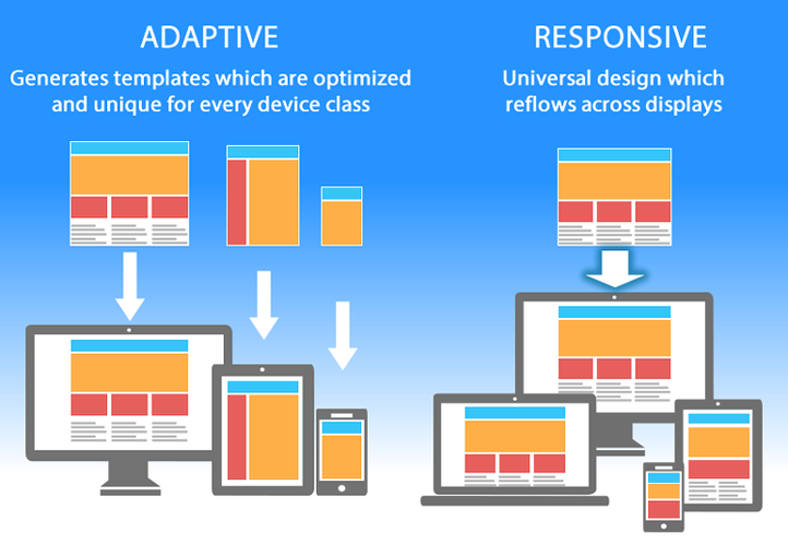
Responsive Vs Adaptive web design

With the increasing popularity of browsing internet in mobile devices, tablets, and similar gadgets, there should be an appropriate way of addressing the issue for rendering websites on these devices.
Where the two methods differ is in their delivery of the responsive/adaptive structures: RWD relying on flexible and fluid grids, and AWD relying on predefined screen sizes. One of the main distinctions between the two is that RWD might take more code and implementation strategies with the fluid grids, CSS, and flexible foundations, while AWD has a streamlined, layered approach, which utilizes scripting to assist with adapting to various devices and screen sizes.
We don't simply pick one, rather we use the best of both.
Consulting Project
ACS is in talks for a consulting project based in Middle East.
New Mobile App signed off
ACS signed a new mobile App for a client based in Manchester
10 successful years
ACS has celebrated its 8th successful year in software industry.